Designing Our New Logos
Us creative agencies occasionally need to give our own brand identities a little tender loving care. At the start of the year, we took the opportunity to do some development exercises for our own business. We’ve gone through huge growth in the last 18 months, so this was a great opportunity to take stock and reflect. We did some good old fashioned workshop sessions, SWOT analysis, customer journeys and goal setting. What came out of the sessions were our three main strengths as an organisation: The skills of our team, our environmental work, and our personalities and humour that makes us (we hope) great to work with. So how do we ensure we communicate this to clients?
We came up with lots of ideas and quickly realised they could be broken into three themes: knowledge and skills, entertainment factor, and the environment. To keep categories distinct, we decided to create three distinct content streams, giving each its own content style, primary colour, and logo. This blog post will delve into how we created those three new logos, and refreshed our main branding at the same time.
Our Three Content Streams
The new logos needed to reflect the content streams themselves, so here’s a quick summary of each:
AMP-UP – This is the education and skills sub-brand. This features blog content, videos, graphics and animations designed to both showcase our capabilities as creatives and to improve the creative skills of our readers and viewers. Everything from advice on creating logos to Adobe tutorials, to webinars.
AMP Earth – This is (you guessed it) the environmental sub-brand. Content created is intended to raise awareness of environmental issues, inform people about our eco initiatives, and encourage them to get involved in helping the environment.
AMPIRE – This is the entertainment sub-brand. We aren’t afraid to let our hair down, and this is where we show it. Content created focuses on showing our fun side; this year, all of this content will be Star Wars focused, everything from videos to graphics. (Yes, this is a VERY nerdy office)
The theme logos would need to be clearly connected, yet different enough to not be confused for one another. We were fairly sure our new logos would be closely linked to our main logo, probably variations of it, so before we started development of the sub-brand logos we took a long, hard look at our current branding.
Refining Our Current Logo

It had been a little while since our main brand had undergone any kind of development. We’d been considering getting rid of the company name beneath the AMP logo for a while, and we decided to go ahead with this. There were two main reasons for this:
- While the AMP looked good in this font, we felt the full company name didn’t.
- Removing the company name and leaving just the AMP turned the logo into a letterbox shape. This shape is better suited to a wider range of different uses.
The imbalance created by the length of the descender on the P of AMP had also been bugging our Head of Creative, Chris, for a while, so he took the opportunity to shorten it slightly. We also created full brand guidelines for ourselves, setting out the right fonts, point sizes, background colours, logo positions, and more, refreshing our proposal and presentation style while we were at it.
With the main brand refined, it was time to look at the new logos.
Getting Started with the New Logos
Our graphic design gurus (Head of Creative, Chris, and Creative Producer, Emma) got to work coming up with ideas. They scoured the web for inspiration, and created mood boards on Pinterest.
To begin with, most ideas revolved around filling the AMP shape of the main logo with imagery corresponding to each content category.
- Leaves & forest-type imagery for AMP Earth
- Creative imagery (or tools of the trade) for AMP-UP
- Space/Star Wars-themed imagery for AMPIRE
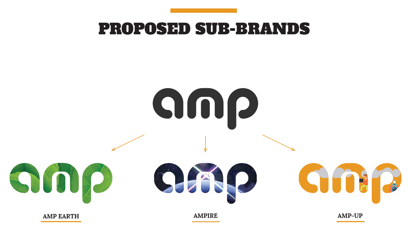
We tried both graphical solutions and photo-realistic ones, and quickly decided that a graphical solution was preferred. Because they’re vector-based, graphical solutions are easier to scale and can be used without adjustment in a wider variety of situations. Shrinking a photo-realistic solution (for use in a letterhead, for example) would quickly result in a loss of detail; not the case with graphical solutions.
Chris and Emma had a good handle on what they wanted to do for the AMP-UP and AMP-Earth, but AMPIRE was proving trickier.
Joining the Dark Side
The trickiest of the three, the AMPIRE logo became the focus of most effort.
Chris worked on versions that had the Death Star looming within the letters and Star Destroyers flying behind it, but there were issues with this. The Death Star was too large an object to fit inside the logo and still look good, and inserting only a part of it left it unclear what it was supposed to be. Likewise, making the Star Destroyers large enough to see detail didn’t look good, and it was hard to tell what they were if they were left small shrunk down.
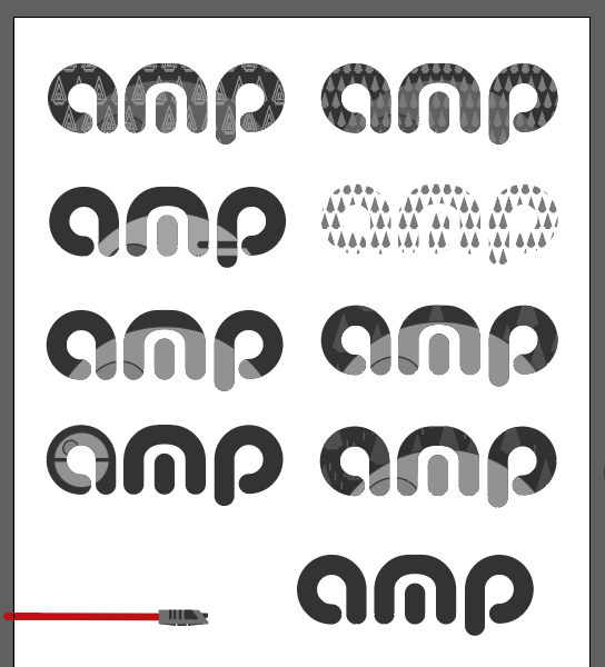
Emma had come up with the idea of using iconic crossed lightsabers, but this again had its own issues. She and Chris quickly realised it negatively affected legibility, especially where the logo would appear in a single colour.
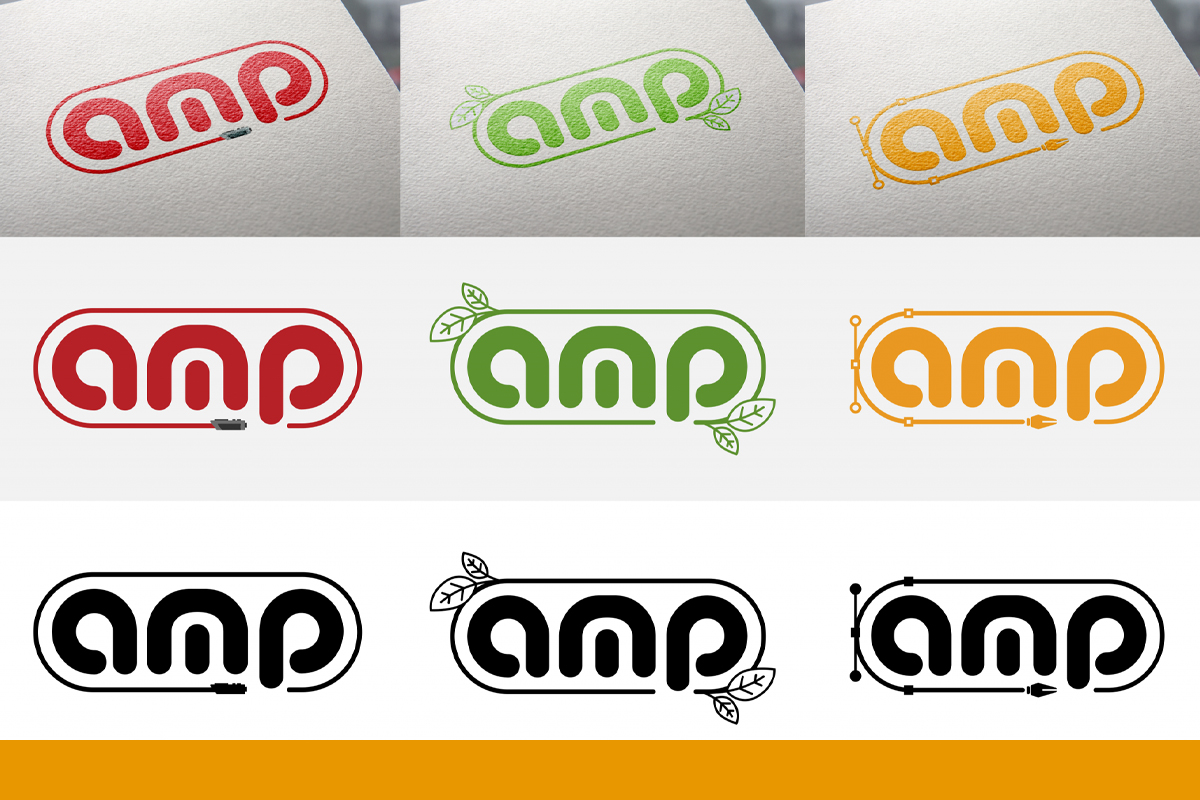
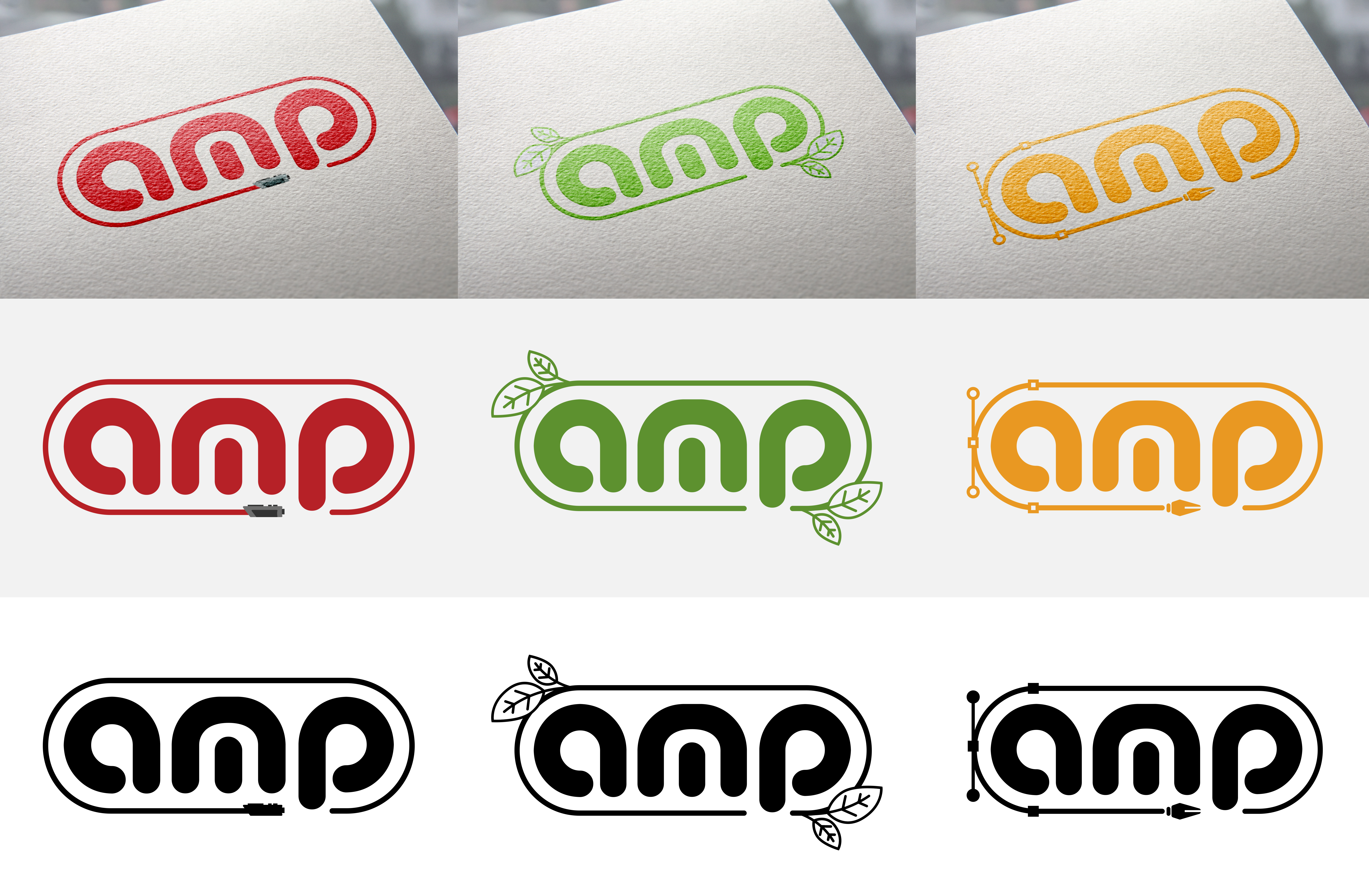
But all this talk of lightsabers gave Chris a brainwave. He positioned a lightsaber shape beneath the AM part of the logo. Seeing how this balanced nicely with the descender on the P, he extended the lightsaber, creating a frame or stroke all the way around the logo, meeting the descender on the other side. Not only did this look great, but it resulted in a balanced, capsule-shaped logo. The logo was coloured a matte red, with the lightsaber hilt in shades of grey.
A Style Is Born
The shape and style of the AMPIRE logo informed the development of the other two. Chris rendered the AMP Earth logo in a green Emma had found that complements the orange of our main brand, and drew a stroke around it in the same colour. It had been an idea from the outset to use leaves as part of the AMP Earth logo, and adding them in the top left and bottom right proved to be the right call.
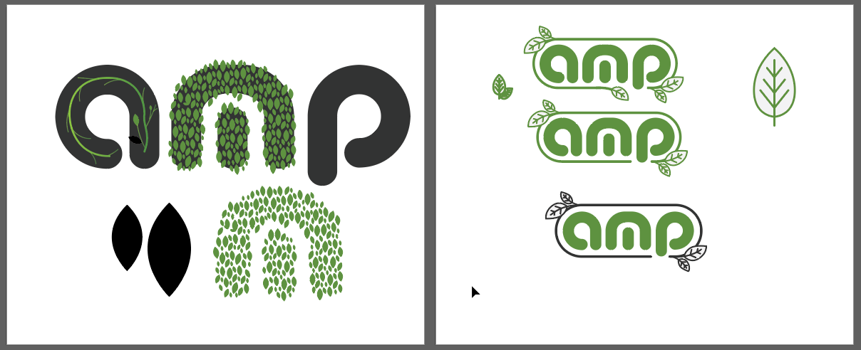
Chris experimented with leaf shapes and line thickness, eventually deciding on a pairing he liked. The weight of the stroke around the logo informed the weight of the strokes used to create the leaves, making the whole thing feel cohesive.
Next up was the AMP-UP logo. Chris again began with a stroke around the logo, ensuring all three logos would look like variations of one another. He then began thinking about how best to represent the educational content we’d be creating in logo form, and the choice suddenly became obvious: The pen tool from the Adobe Creative Suite.
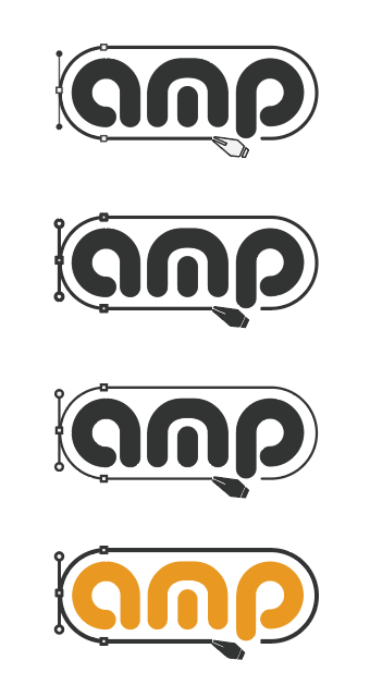
The pen tool is one of the most commonly used tools for all graphic designers. Chris took inspiration from this and added the Bezier curve, Bezier points, and pen tool symbol to the stroke around the logo.
The Finished Logos
And here are the results. Three logos to champion our AMP Earth, AMP-UP, and AMPIRE marketing themes. We’re incredibly happy with them! What do you think? Keep an eye out for these appearing all over* our content throughout 2020.
Thinking of launching a new brand? Want to give your existing brand a little TLC? Our graphic design gurus can help. Please get in touch today and let us know your plans.
*Our new brand guidelines suggest plastering the logo ALL OVER something is a bad idea.


