Defining Brands Using Bold Colour
This is the first in our series of posts about colour and branding. Check out our second post on choosing a colour palette for your website.
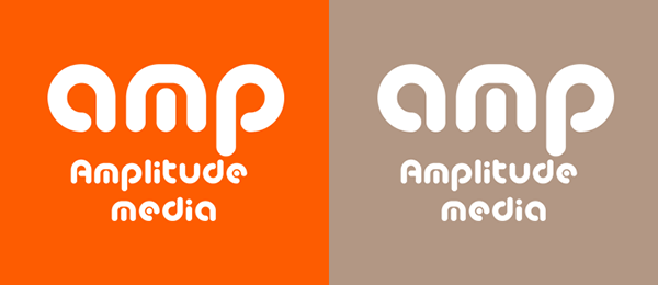
Colour affects us all, yet colour’s ability to help define brands is often overlooked by marketing professionals. Many simply go for what looks “flashy” or “pretty”, but choice of colour can completely change the way people feel about a company or product. Amplitude began using a juicy burnt orange colour in our branding a few years ago. It’s an exciting colour. It’s vibrant and youthful. Can you imagine how different our brand would feel if we’d gone with taupe instead?
Many brands use bold splashes of colour in their logos and branding, and it’s pretty common for colours to become unconsciously associated with a particular brand. Imagine Netflix without its red, McDonald’s without its yellow M, or Google without its blend of bright colours. As marketeers, that level of colour-to-brand connection is the holy grail of colour brand definition. Take a look at the blocks of colour below. Can you name the drinks brands that use these colours?

Bold colours are everywhere, and can have subtle – and not so subtle – effects on our psychology; even taupe has its place (just not behind an Amplitude logo). Keep reading for a run down on what different colours might say about your brand.
Reds
Ever noticed how most “SALE” signs in shops are white text on a red background? There’s a reason for that. Human eyes are drawn to red. It’s urgent and immediate, and makes people more likely to make impulse purchases.
That’s why you’ll find red used by a lot of business-to-consumer brands, particularly those that sell large amounts of small-value goods. Reds are often used in situations where people don’t need to spend hours debating whether a product or service is right for them.
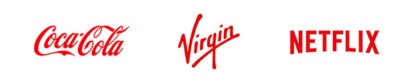
Red can evoke love, excitement, and even anger (think outrage marketing and news organisations). Reds are bright and warm, can bring a touch of heat or sexiness to your brand. Famous brands making excellent use of reds include Coca-Cola, Netflix, and Virgin. Exuberant brands that are constantly innovating.
Fun fact: Bulls can’t see red, so it doesn’t matter what colour a matador’s flag is.
Blues
By contrast, blues can bring a sense of calmness to your brand. They’re cooler colours that can evoke a sense of seriousness or professionalism. They’re not as exciting as reds and oranges, but they’re used differently. You’ll find a lot of blues used in scientific and healthcare industries, in technology, recruitment, and banking.
The calmness of blue helps build trust between a business and client, and suggests wisdom and loyalty. Sure, it’s less immediate than red, but blue looks more reliable, which is exactly what you want in the business-to-business realms where contracts could be worth millions and relationships can last years, even decades.
Famous brands making good use of blue include Barclays, Intel, Ford, and our client, Reed Professional Services. These are all brands that want you to know that your safety, money, information, or project is being looked after properly.

Fun fact: Blue was seldom used in Greece and Rome, to the extent where researchers once questioned whether they could even see blue (they could). Today, it’s possibly the most popular colour out there.
Greens
Look for famous green logos and you’ll undoubtedly come across countless companies connected to health and the environment. Green is strongly connected to both. We associate green with good health, nature, and positive feelings (how good does it feel when all the traffic lights on your daily commute work in your favour?).
You might want to use a green as a brand colour if your company is closely associated with healthcare or environment industries. Likewise, green might be the colour for you if you’re aiming to appeal to consumers that are rurally-based or spend a lot of time outside. If a key feature of your product is that it’s made from all-natural ingredients, green can help you emphasise this. Imagine if Pepsi released a new product with green packaging. What might be different about that product? Could it be that the ingredients are naturally sourced? That’s exactly what Coca-Cola did with Coca-Cola Life.
Famous brands utilising green in this way include Animal Planet, John Deere, Land Rover, and Sprite. All of these brands either work within the environment, sell to people working in the countryside, or produce products with natural ingredients they want consumers to know about.

Fun fact: Green was a popular choice of wedding dress colour until the 1400s.
Yellows
Yellows are bright and sunny; warm colours that evoke a sense of happiness. They’re used to bring a sense of excitement and cheeriness. Like reds, they’re also pretty good at attention grabbing and are often used on signage to indicate discounts or sales.
Yellows are also closely associated to emergencies and warnings. You’ll often see yellow used by emergency services or by organisations at work on the roads. They’re great for businesses that work quickly under potentially stressful or dangerous conditions.
Companies like McDonalds and Snapchat make good use of the exciting, playful side of yellow. Organisations like the AA (the Automobile Association) and DHL use yellow to let you know they’re all about speedy response, and to make sure you notice their brands when you’re out on the roads.

Fun fact: The colour yellow is one of comic book hero Green Lantern’s weaknesses.
Orange
Orange may be the new black, but that doesn’t make them interchangeable! Oranges are exciting and energetic. Brands using orange aren’t afraid of change and are often found at the cutting edge of their industries. Orange is the go-to colour for brands in all kinds of industries looking to set themselves apart from the competition.
Orange can also bring a sense of playfulness and cheekiness, which is great for brands like ours that like to take a more conversational, chatty tone.
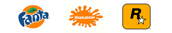
Other brands using orange to great effect include Fanta, Nickelodeon, and Rockstar Games; all bright, youthful companies that have evolved over the years in the face of industry and audience changes. Companies that have been around for decades, yet still feel exciting and fresh.
Fun fact: Some canaries can turn from yellow to orange if fed a diet that includes red pepper.
Purple
Purples can evoke feelings of quality, wealthy, mystery, and – like orange – cheekiness. Purple is a great colour for companies using higher quality to get an edge over their competitors. It’s heavily used for luxury products, everything from quality chocolate to greetings cards to sofas.
Purple can also be used to bring a touch of mysteriousness or playfulness to a brand. It’s commonly used by quirky B2C brands to emphasise the fact that they’re… well… quirky. This, again, is a great way to distinguish yourself from competitors that play it straight.
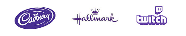
Cadbury, Hallmark, and DFS are examples of brands using purples for their luxurious feel, while brands like Twitch, SyFy, and Innocent use it to set themselves apart from their less-quirky competitors.
Fun fact: For his role in Star Wars, Samuel L Jackson insisted on having a purple lightsaber so he stood out in battle scenes.
White
White has long been the colour associated with cleanliness, space and neutrality. It is often a background colour, used to make other colours stand out. When logos are rendered in white, they’re usually against a coloured background, so the colour of the background is usually what defines the brand.
Even if you don’t plan to use white in your logo, you’ll need to consider how much white space (or negative space) you have around your logo, on your website and branding in general. How much empty space do you need around your logo to ensure it looks good?
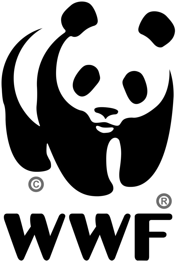
White can be used creatively to make a logo that stands out from the crowd. Consider WWF’s panda logo if you’re looking for a creative use of white in branding.
Fun fact: Water and ice are both transparent, but snow appears white because the multitude of surfaces within it cause all wavelengths of light to be refracted and reflected back at us.
Black
Black is the colour of strength and authority, used by businesses that want to be taken seriously. It’s therefore no surprise that many government agencies and departments around the world use black logos and nothing else.
Many companies develop plain black alternatives of their logos to use when their communications need a more authoritative air. As with white, if using black as your background colour, you’ll need to consider how much negative space you leave around your logos, on your website, and in your surrounding branding.

Fun fact: The name “Black Friday” was the name police attributed to the busiest shopping day of the year, because the number of incidents skyrocketed; that’s where the name of the sales event comes from.
Browns
Browns are highly variable. They can bring a touch of reliability and warmth to your branding. Warm browns are often tied to the natural environment, while more muted browns can be used to evoke feelings of luxuriousness.
Browns are often used by coffee sellers, chocolate producers, and breweries to make you think of the look, feel, and taste of their products. Muted browns (such as taupe!) are used by mature luxury interiors and fashion brands.
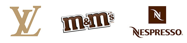
Companies like M&M’s and Nespresso use the taste-evoking side of brown, while Louis Vuitton and Yves Saint Laurent effectively partner brown and gold in a lot of their branding to bring a sense of luxury and extravagance.
Fun fact: Before he had a red suit, Santa was depicted in a tan suit.
What’s right for you?
Not sure what’s right for your brand? That’s why we’re here! Amplitude has helped countless companies develop and refine their branding, and we’re more than happy to help you too. Click here and tell us all about you and your company. Let’s see how we can help.
Related Posts
-
Making A Difference: Creating Content to Drive Action for Good
April 27, 2023 -

Tom’s Marketing Tales: Client product photography dissected and explained
June 24, 2022 -
Play as Part of the Creative Process
May 17, 2022