Colour Palettes and Brand Identity
Our last post colour-related looked at what different colours can say about your brand. Whether you choose an exciting orange or an elegant purple as your main brand colour, it’s unlikely that will be the only colour you use. Odds are you’ll need other colours on your website, social media profiles, product/service literature, and elsewhere. These other colours should work well alongside your main brand colour, and, when combined, will form a large part of your overall brand identity. This combination of colours is called a colour palette.
There are five commonly used types of colour palette, which we’ll run through over the course of this blog post. Having a choice of five palettes to choose from might sound restrictive, but the examples further down this page ought to change your mind.
As with choice of logo colour and design, the colour palette you choose can become closely associated with your brand. It’s all the more important, therefore, that you understand which colours go together best, giving yourself the best chance at achieving a good level of brand recognition. And remember, colour psychology applies to these too. Choosing a bright orange to go with your calm blue will change how people view your brand.
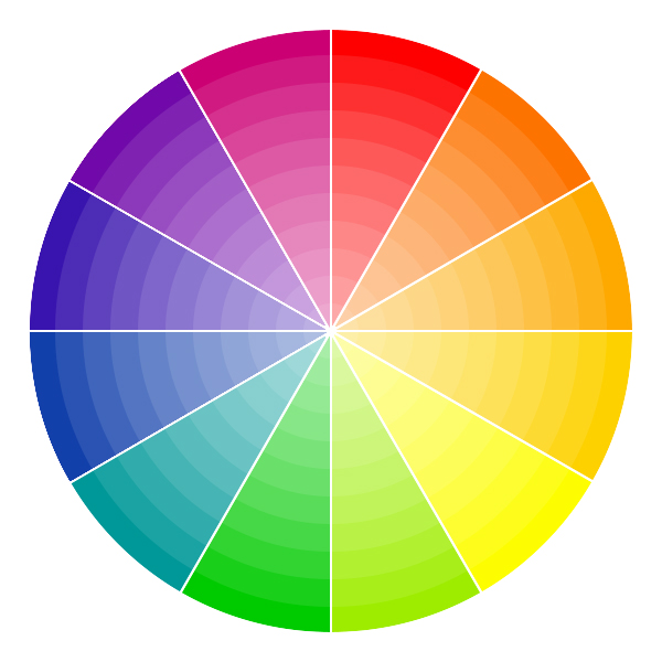
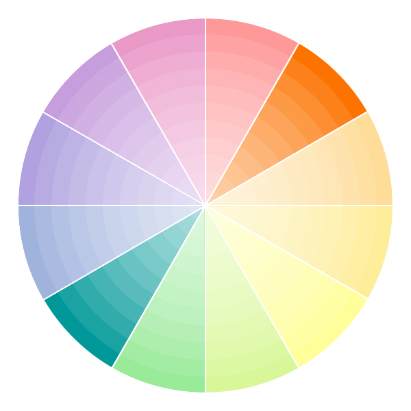
Before we jump into looking at websites using these the five palettes, take a quick peek at the colour wheel below. Wheels like these are used by professional graphic and web designers to help them create stunning designs and websites. You’ll be seeing it a lot over the next few minutes.
 Without further ado, here we go…
Monochromatic
Probably the easiest to grasp, monochromatic colour palettes use different shades of the same base colour, plus white or black (sometimes both). Monochramatic colour palettes are easy to make look elegant.
Example 1: Reed Professional Services https://www.reedps.com/
Reed Professional Services handle contracts for large UK organisations, inserting specialist teams to manage and execute projects requiring specific expertise. The combined blue and greys of the logo makes them seem reliable, trustworthy, and approachable.
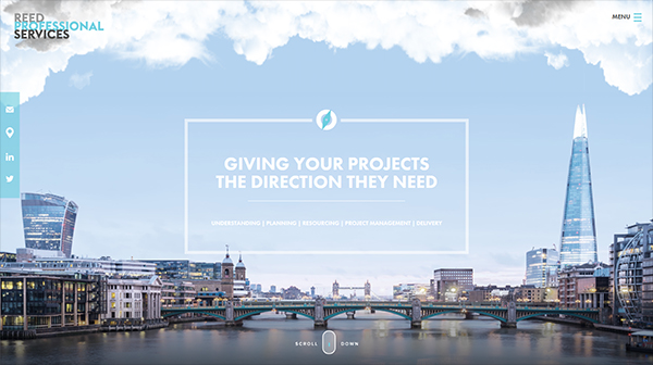
Reliability is reinforced and heightened by the blues in their website. The inclusion of white in rather than black or dark grey ensures makes the brand feel friendly and approachable. These colours are present everywhere, even in blog feature images.
Example 2: Firewatch https://www.firewatchgame.com/
Campo Santo’s excellent Firewatch website makes great use of a rusty orange palette (with occasional hints of yellow). The use of orange here is meant to evoke thoughts of fire and burning, matching the theme of the game and title.
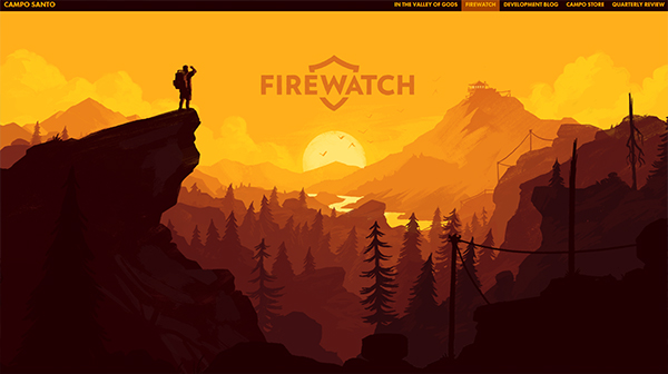
On a side note, look at that use of parallax. Phwoar!
Complementary
Complementary colour palettes use colours that work together from opposite sides of the colour wheel. Usually, a site will choose one of these colours as its main colour, and use the contrasting colour to highlight calls to action and draw the eye to specific parts of the site. Using the two colours equally prominently can make a site look messy and unfocused, so take care when designing with this colour palette.
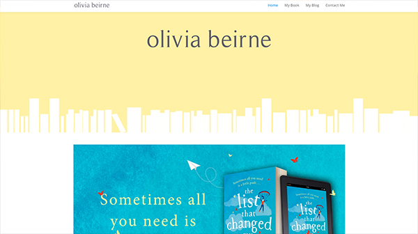
Example 1: Olivia Beirne http://oliviabeirne.co.uk/
Author Olivia Beirne’s website, designed by Lydia Dominguez, uses pale yellow as its base colour and electric blues as highlight. The yellow is calm and welcoming, but, as you scroll, the blue draws the eye to an advert about the author’s book.
Example 2: Futuramo https://futuramo.com/
Green and purple is a complementary pairing that’s rarely seen, but some sites make great use of this combo. Futuramo chose purple as their main colour, and use green as a secondary colour to bring attention to their buttons.

Analogous
Analogous colour palettes use several colours that are close together on the colour wheel. More varied than monochromatic palettes, and less contrasting than complementary palettes, analogous palettes are great for bringing a touch of variety to your site without moving far away from your main brand colour. You have more flexibility with how you use colour here. Because the colours are adjacent on the colour wheel, there’s less chance of them clashing or making your site look messy.
Example 1: Cancer Research UK https://www.cancerresearchuk.org/
Cancer Research UK chose a logo making use of blues, pinks, and purples. The dotty design looks somewhat scientific, and evokes the idea of people coming together. It’s quite vibrant, adding a bright touch to a potentially morbid topic.
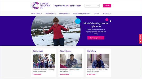
Now take a look at the rest of the site. Those logo colours are everywhere. Purple is the main colour, but the blues and pinks are used as contrast to make calls to action stand out. Even the feature images for their blog posts use their colour palette. You have to look pretty hard to find green or yellow featured anywhere prominently on their site.
Example 2: Innocent Drinks https://www.innocentdrinks.co.uk/
This cheeky smoothie company have a deep purple as their brand colour, but use lighter shades of pink, purple, and blue prominently on their main page.

Navigate away from the main page and you might notice green suddenly appear, bucking the trend! Green comes in wherever Innocent are talking about the natural aspect of their drinks. Notice too how the blues and pinks disappear when green is in play. Innocent have cleverly used an analogous palette on their main page (purple, pink, blue), but a complementary palette on some sub-pages (purple and green), marking them out as special topics.
Triad
Probably the trickiest colour palette of the five we’re covering, triad palettes use a combination of three colours from equidistant parts of the colour wheel. Triad palettes can be used to great effect, but it’s also very easy to stray into messy design, overwhelming visitors with a plethora of colours. As with other multi-colour palettes, it’s best to choose one colour as a base, then make clever use of the other colours to draw the eye or differentiate between services.

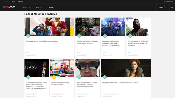
Example 1: HMV https://www.hmv.com/
HMV use only subtle touches of colour on their site, but do so to good effect. Their main brand colour is a vibrant pink that pops against their black background. HMV then use blues and yellows to differentiate between the two main categories of products they sell. Blue means film or video. Yellow means music. It’s simple, yet effective.
Pop
Pop colour palettes use a single colour, and pair it with whites, greys, and blacks. These palettes are often used by brands that want to make an immediate impact on their website visitors. Pop colour palettes may give you an edge building brand recognition, particularly in small marketplaces.

Example 1: Virgin Media https://www.virginmedia.com/
The red of Virgin Media’s logo is highly recognisable, and that same colour permeates right through Virgin Media’s website and social profiles. Almost everything is signature red, dark grey, or white. Even the photos and graphics on their site feature a healthy dose of red, or at least a red-toned overlay.
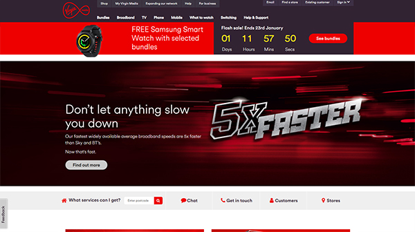
On a side note, take a look at the Virgin Atlantic website. Similar colour palette but with more white and pink. It’s a subtle change that differentiates the two brands, but the both sites use the same red, subtly linking them as part of the same family of businesses.
Amplitude Media. http://www.amplitudemedia.co.uk
We won’t harp on about our own site too much, but you might have noticed we’re fans of orange. It’s everywhere, from the front page of our website to our Twitter feed, from our graphics to our blog feature images. While there are a few different oranges in use on our site, they don’t stray too far from our signature orange.
Your Turn
Take a look at the websites of your favourite brands. Pay attention to the colours they use and keep an eye out for palettes you don’t like too. Learning what not to do can sometimes be as valuable as learning best practice. Got a website that you think makes excellent use of colour? We’d love to see it. Drop us a tweet!
Warm vs Cool
One thing to bear in mind when choosing a palette is the difference between warm and cool colours. The red, yellow, orange side of the colour wheel tends to be warmer than the blue, green side. Whether you go with warm or cool palettes can change how people feel about your brand. Compare the two examples we gave for monochromatic palettes. Firewatch is effortlessly warm, while Reed is cool and calm. See what we mean?
How to pick a palette
Hopefully the last few minutes have helped you hone in on the right colour palette for your brand. There aren’t many hard and fast rules when it comes to which palettes suit different types of businesses. It’s common for more exciting industries use more colours in their palettes, but even that isn’t true for everyone.
Before we close out this blog, here are a couple of tools to help you along:
Coloors: http://paletton.com/
Coloors is great for people who have a main brand colour already established and want to know which other colours work with it. In just a couple of clicks you can get it to give you a whole list of colours that work well with your chosen main colour.
Paletton: http://paletton.com/
Paletton is great for people starting from scratch, and for those who like to see examples of their chosen colours working together. You can choose from monochromatic, analogous, triad, and even tetrad*, and the site will instantly show you how your selected colours might work (or not work) together.
Of course, if you want a helping hand from some design professionals, we’re always here to help. Drop us a line and let’s have a chat.
*This is sometimes included in lists of common colour palettes, but we don’t think it’s all that common. Tetrad sites are hard to pull off and aren’t for the faint of heart. Google them if you dare. (Funnily enough… Google’s logo uses a tetrad colour scheme, but their websites are mostly white. I wonder why that is…)
Related Posts
-
Making A Difference: Creating Content to Drive Action for Good
April 27, 2023 -

The Rise of Short Form Social Media
October 24, 2022 -

Central Changemakers and the Four Day Work Week
September 30, 2022